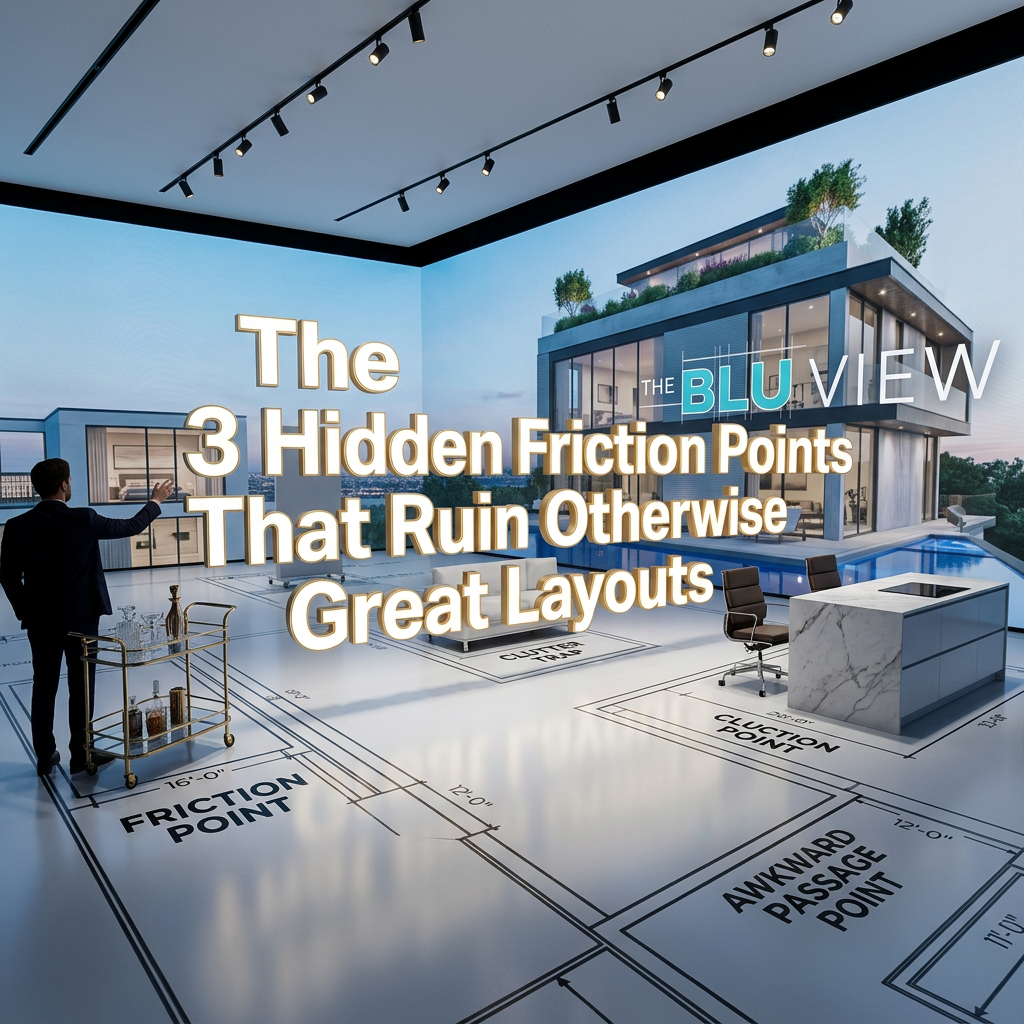
You can have a layout that checks every box.
The rooms are in the right places.
The dimensions make sense.
The design looks clean and modern.
And yet… something feels off.
You can’t always explain it, but you feel it when you walk through the space.
At The BluView, we see this all the time. Projects that look perfect on paper—but fall short in real life.
Why?
Because of hidden friction points.
These are subtle design issues that don’t show up clearly in plans—but quietly disrupt the entire experience.
What Is “Friction” in Design?
Friction is any moment where movement, flow, or usability feels slightly uncomfortable.
It’s not always obvious.
It shows up as:
- A pause where there shouldn’t be one
- A hesitation before moving forward
- A subtle feeling that something is “off”
Individually, these moments seem small.
But together, they define how a space feels.
And in high-end design, even small friction points can turn a premium project into a frustrating one.
Why Great Layouts Still Fail
A layout can be technically correct—and still fail experientially.
That’s because most layouts are designed visually, not behaviorally.
They focus on:
- Placement of rooms
- Square footage
- Aesthetic balance
But they often overlook:
- Movement
- Transitions
- Spatial relationships
This is where friction is created.
And it’s why a “perfect” layout can still feel wrong.
Friction Point #1: Tight or Awkward Transitions
Transitions are where movement either flows—or breaks.
When transitions are too tight, poorly placed, or misaligned, you feel it immediately.
Common issues include:
- Narrow pathways between key areas
- Doorways that open into movement paths
- Sudden compressions between larger spaces
Even if everything meets code, it doesn’t mean it feels right.
In premium design, transitions should feel:
- Effortless
- Open when needed
- Seamless between zones
If you feel resistance when moving through a space, the transition is the problem.
Friction Point #2: Misaligned Openings and Sightlines
Your eye leads your movement.
When openings, doors, and visual lines are misaligned, it creates confusion—even if the layout is technically functional.
This can show up as:
- Doors that don’t align with natural pathways
- Views that abruptly stop instead of extending
- Spaces that feel disconnected visually
Alignment creates clarity.
When everything lines up:
- Movement feels intuitive
- Spaces feel connected
- The design feels intentional
When it doesn’t, the experience feels fragmented.
This is one of the most overlooked architectural design flaws—because it looks fine in drawings, but feels wrong in reality.
Friction Point #3: Poor Spatial Sequencing
This is the most powerful—and most hidden—issue.
Spatial sequencing is the order in which you experience a space.
If that sequence is off, the entire design feels disjointed.
You might experience:
- Spaces revealing themselves too quickly or too abruptly
- No clear progression from public to private areas
- A lack of rhythm in how the space unfolds
Great design has a natural flow:
- Entry → Transition → Open space → Intimate space
Poor sequencing disrupts this journey.
It makes the space feel confusing, even if each individual room works.
Why These Issues Go Unnoticed
These friction points are hard to catch because they don’t show clearly in:
- Floor plans
- Static renderings
- Technical drawings
They only reveal themselves when you experience the space in motion.
That’s why so many projects move forward with hidden issues—until it’s too late.
The Real Cost of Design Friction
Friction doesn’t just affect comfort.
It impacts:
- Daily usability
- Client satisfaction
- Perceived quality
- Long-term value of the space
A space with friction feels:
- Less premium
- Less intuitive
- Less enjoyable to live in
Even if it looks high-end.
How to Identify Friction Before It’s Built
The key is simple:
Experience the design before construction.
Walk through it—physically or virtually.
Pay attention to:
- Where you hesitate
- Where movement feels tight
- Where things don’t align naturally
These are your friction points.
And they’re much easier to fix before construction than after.
The BluView Approach to Eliminating Friction
At The BluView, we focus on removing friction before it ever becomes a problem.
We help clients:
- Identify hidden design issues early
- Refine transitions and spatial relationships
- Align openings and improve flow
- Validate the full experience before approval
Because the goal isn’t just to create a good layout.
It’s to create a space that feels effortless.
The Difference Between Good and Exceptional Design
Good design works.
Exceptional design feels effortless.
The difference is friction.
Remove it—and everything changes.
Movement becomes natural.
Spaces feel connected.
The experience becomes intuitive.
And that’s what defines a truly high-end project.
The Takeaway
Your layout might look perfect.
But if it has friction, it won’t feel perfect.
Look beyond the plan.
Focus on the experience.
Test the movement.
Because in the end, great design isn’t just about what you see.
It’s about what you feel when you move through it.